An introduction to map projections
Many years ago I worked for a company that wrote Geographic Information Systems (GIS) software. A GIS application lets you work with different kinds of geographic and relational data, doing various kinds of analysis and representation. My job mainly involved developing the image processing and display software, but also some work on the map reprojection code. I always found the area of map projection interesting, not just from the technical point of view, but also from its impact on historic, social and political perspectives.
I used to give a talk to new staff members about map projections; this article is based on what I would cover, along with some ideas on how you can use reprojection tools today.
What is a map projection?
As we [mostly] know today, we live on the surface of a spherical object. One of those globes you saw in high school is a pretty accurate representation of the earth’s surface. The size, position, and orientation of the features on the globe are accurate and can be used to make measurements. But a globe is unwieldy and we would much rather have a map that can be represented on a computer screen or a piece of paper. If you’ve ever peeled an orange or maybe cut up a balloon, you’ll understand that you cannot take the map on a globe and put it on a piece of paper with stretching or squashing it in various ways. You will need to compromise one or more areas of measurement in order to to this. These include:
- Area. If you place a coin on a sphere, it will cover the same amount of the surface no matter where you put it. If you do the same on a map, the mount of area covered can vary depending on where you place it.
- Angles. The lines of longitude and latitude intersect at right angles on a sphere. On most maps this is no longer the case.
- Scale. A distance of 1cm on a map may represent different distances in the real world depending on where you measure it.
A map projection is the mathematical transformation from features on a spherical surface to a flat surface. There are many different ways to do this; the one you choose is determined by how you want to use the map. A map used for navigation at sea is very different from one where you want to preserve the size of countries.
Geometric map projections
The simplest kinds of map projections are geometric ones, where the features on the earth’s surface are “projected” on to a cylinder, cone or plane. When I talk about projection here, I am referring to a geometric operation, where rays are drawn from a fixed point through the earth’s surface until they intersect with the projection surface (the cylinder, cone or plane). The feature at the point where the ray intersects with the earth’s surface is copied to the projection surface. When this is done for all possible points, the projection surface is unrolled if necessary (for a cone or cylinder) and you have your new map. Many of the most common map projections are done using such techniques.
Cylindrical projections
Probably the first and one of the most common map projections is the Mercator projection. This is constructed by wrapping a cylinder around the earth so that its axis is aligned with the earth’s rotation axis and its diameter matches the earth’s diameter at the equator. You can’t really show the polar regions on a Mercator projection because your cylinder would have to be infinitely tall. To make such maps manageable, they typically only extend to around +- 80° latitude. You can easily recognise a Mercator projection map because it covers the whole world (except the polar region), is rectangular, and countries like Greenland are hopelessly distorted and enlarged (in fact, Greenland is less that 1/3 the size of Australia).
So, why would we use such a projection? Well, you’ll notice that the lines of longitude and latitude form a rectangular grid, and therefore angles are preserved (this is known as a conformal projection). If you are sailing your ship on constant bearing, this will be a straight line on the map. That makes this map great for simple navigation (although you should realise that such a course is usually not the shortest distance between two points).
Having said that, the region around the equator is relatively undistorted. So it is a reasonable representation of that part of the earth’s surface, and could be used for larger scale mapping in those regions. A very common variation of this projection is to rotate the cylinder 90° and position it so that it touches the surface along a line of latitude that is of particular interest. Such a projection is known as a Transverse Mercator projection, and it commonly used in larger scale mapping around the world. A system known as Universal Transverse Mercator (UTM) divides the world into vertical strips 6° wide (a “zone”) and centres an instance of the Transverse Mercator projection for each strip.
There is yet another variation known as the Oblique Mercator projection, where the cylinder’s axis is at some other angle to the earth’s axis, other than 0° or 90°.
Conic projections
If you want to best represent large areas of the world especially for one of the temperate zones, then a conic projection is often used. This works the same way as for the Mercator, except that features are projected into a cone. A major difference with the result is that the map is no longer rectangular. Secondly, in most variations the lines of latitude form concentric circular arcs and the longitude lines converge on one of the poles.
Conic projections are often used to represent wide areas such as the USA and Europe in a projection that gives a better representation of the shape of areas.
Some common conic projections that are used in mapping are (you can guess what attribute each projection tries to preserve from their name):
- Albers Equal-Area Conic projection – preserve area
- Lambert Conformal Conic projection – preserve angles
- Equidistant Conic projection – preserve distance
Plane projections
Projections directly onto a plane are known as “azimuthal” projections. There are several different types, but the most well-known are probably the Orthographic and Vertical Perspective projections.
The Orthographic projection maps a hemisphere of the earth from a point infinitely far away onto a plane. You can think if it as a view of the earth’s surface if seen from a long way away through a telescope. Obviously you can only represent one half of the surface in such a projection, and features become more distorted as you move away from the centre, as the surface becomes more oblique.
The Vertical Perspective projection is very similar, except that the projection point is located relatively close to the earth’s surface. You can think of this as the view you would get from a satellite in orbit. Because you are closer to the earth’s surface, you see less than half the surface at a time (maybe much less). The Tilted Perspective projection is similar except that the projection is not centred on the earth’s centre, so you are looking across the surface of earth.
These azimuthal projections are not so important for mapping as such, but with the advent of the space age, they have become extremely common for representations of the “astronaut’s view” of the earth.
Other map projections
The mapping of features from a sphere to a flat surface is a mathematical operation, but it doesn’t have to be based on simple geometry. In the end, there are infinitely many way to do it. These days, computers are fast and ubiquitous, so we are not limited to projections that are easy to calculate. So, the choice is projection algorithm is dictated by what information it is desired to present.
Some projections aim to make the world “look right” by making a compromise between the different distortions, for example the Robinson or van der Grinten projections.
Other projections have been created to emphasise a specific attribute, sometimes at great expense to a visually realistic appearance. The Peters projection is a somewhat controversial projection that preserves area, at the cost of some distortion of shape. It was created to counter a perceived “bias” in the Mercator projection that makes countries of the northern hemisphere look too big when compared to the southern hemisphere. Of course, such a projection just introduces a different “bias”, which just reinforces the point that all map projections have some bias or distortion.
One technique that has become common in recent years is to scale each country’s size according to some metric (e.g. population, average income, greenhouse gas production etc). Such maps are hopelessly distorted for measurement purposes, but are design to show one particular aspect above all others. You can see a lot of examples at the Worldmapper site.
There are a number of maps projections that map the earth’s surface to a regular polyhedron. These can be printed out, folded and glued to make a 3D map. Such projections are for amusement value only (but that doesn’t mean they aren’t valid projections). See Carlos Furuti’s “Polyhedral Maps in Paper” page for some polyhedral maps you can make.
Defining a Map Projection
Now we’ve talked about what map projections are, I am going to discuss some practical aspects of working with them. To do this, we need to understand how a map projection is defined. This will be useful next time you look at a paper map or perhaps configure the settings in a GPS device. In order to do this, we’ll need to define some terms, and show how they are combined to define a map projection.
Firstly, consider the earth’s shape. I glossed over this above, but you probably won’t be surprised to learn that it is not actually a sphere. In fact it is quite a complex shape, but for our purposes it is close enough to an ellipsoid, an ellipse that is rotated around on its shorter axis (think of a basketball that is squashed down on the top and bottom). Using an ellipsoid makes calculations vastly easier that if we tried to work with a more accurate model. Now, to locate a place on the ellipsoid’s surface, we need to define a Geographic Coordinate System (GCS). This consists of the following:
- Ellipsoid dimensions – you need two of the following: the semi-major axis size, the semi-minor axis size, the eccentricity, the inverse flattening.
- Axes – lines of latitude are parallel to the equator, lines of longitude are at right angles to the equator and pass through the poles.
- Prime Meridian – the line of longitude which serves as your origin (you don’t need one for latitude, as the equator serves for this). By convention, this is usually the line of longitude passing through the Greenwich Observatory, in London.
- Angular Unit – nearly always this is degrees.
Given the above, you can quote a position in lat-long coordinates and everyone will be in no doubt as to what you mean.
You’d probably assume that there is one ellipsoid that defines the earth’s shape, but in fact many different ones have been defined. That is because customising the ellipsoid for a specific region of the world can give you a better approximation to the actual shape of the earth for that region. Furthermore, we’ve assumed that the best ellipsoid for a region has to be earth-centred, but this is not necessarily true. In fact, an ellipsoid for a GCS is typically tied to a specific location in the area of interest, known as a “datum”.
So, whenever we talk about a location in lat-long coordinates, this is always with reference to a specific datum (the datum encompasses the ellipsoid parameters as well as the local reference point). To make things more interesting, different datums can be used in the same location at different times (as measuring techniques change).
What happens if you get this wrong? Well, the area where I live has had 3 different datums defined for it over time, known as AGD66, AGD84 and GDA94. If I take the lat-long coordinates for where I live and assume they are in the wrong datum, then the actual position can vary by nearly 200m (AGD84 versus GDA94).
Implicit in the above is the ability to convert coordinates from one datum to another. This is known as a “datum shift”. There are various methods to do this, with varying accuracies and dependent on the datums in question.
WGS84 – the global datum
In recent times, there has been a desire to define a datum that can be used for the whole world. If you are operating on a global scale (e.g. sailing around the world) you do not want to have to deal with different datums all over the place. With the advent of satellite mapping and GPS in particular, the definition of a single “best-fit” earth-centered datum is possible (and in fact is required). The latest version of this datum is WGS84. Your GPS receiver works on WGS84 (although it may perform a datum shift to a local datum if you so desired).
Many countries have a local datum that is very similar to WGS84. In Australia this is GDA94. The difference between the two is no more than 1m, so for most purposes it is irrelevant. However, as position measurements approach centimetre precision things like continental drift become an issue… Australia moves about 7cm per year, so positions will drift in WGS84 but remain constant in GDA94, as its reference frame is adjusted (such is the world we live in today!).
Projected coordinate systems
Now we have a known, accurate coordinate system for locating points on the earth’s surface (or at least an ellipsoidal model). The next step is to transform them to a coordinate system that can be used in a planar map projection. This is known as a Projected Coordinate System (PCS) and consists of the following:
- Projection Type – we gave some examples above)
- Zero or more Projection Parameters. These vary depending on the type of projection.
- Axes – your usual cartesian (x, y) grid
- Origin – the location of the (0, 0) position.
- Linear Unit, usually in feet, miles metres or kilometres.
The projection type and parameters can be used to convert the lat-long coordinates into projected coordinates, and the axes, origin and linear units define the coordinate system.
So, now we have enough information to understand the reference frame used in, for example, paper maps. Pulling one out at random here, I can find the following details:
The projection (“grid”) is the Map Grid of Australia, Zone 56 (commonly abbreviated to MGA56). A quick search shows that MGA56 is an instance of the Universal Transverse Mercator projection, and zone 56 corresponds to a central longitude of 153° east of Greenwich.
Furthermore, the parameters associated with this projection are:
- central longitude – the longitude at the centre of the zone – 153°
- central latitude – conventionally defined as the equator – 0°
- false northing and false easting of 500000m and 1000000m respectively. The natural origin is at the zone centre (0°, 153°), so these offsets ensure that all projected coordinates are positive
- central scale factor – this is a scaling factor to make scaling errors more evenly distributed within the zone
The datum is GDA94, which as we have mentioned above is close enough to WGS84.
Converting between difference PCS coordinates
If you have some data in one PCS, and you need to convert it to another PCS, then you need to go through the following steps:

Practical tools
If you want experiment with conversions to and from different map projections, then I highly recommend the PROJ.4 library. This has a C API, but there are bindings for VB, Ruby, Python, Perl and Tcl (and probably more).
I’ve written a short demo script in perl that shows how to use the perl bindings for PROJ.4 to reproject an image from an Equirectangular projection to an Orthographic projection. Here’s an example of a reprojected map:
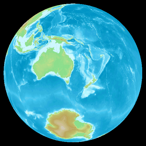
You can find this code on GitHub.
If you want to explore more about the various datums, projections coordinate systems that are in common (and not so common use), then a great place to look is the EPSG Dataset. This data was collected by the European Petrochemical Survey Group (now called the IOGP). Apart from national geodetic organisations, probably the next biggest definer of mapping systems are the companies that explore the globe looking for new resources to exploit.
this is very long and wordy
I disagree with Jeff I think this was elegant and thought provoking.
Thank you for taking the time to put this together.